Sunday, 6 June 2010
Thursday, 3 June 2010
Show Reel and New Blog
Show Reel:
My new blog address is:
http://lmcguiredigitalartist.blogspot.com/
Thursday, 27 May 2010
Tuesday, 25 May 2010
Friday, 21 May 2010
Thursday, 20 May 2010
Tuesday, 18 May 2010
sound and animation clean up updates
an updated play blast with synced sound. still some camera alterations to be made.
Monday, 17 May 2010
Sunday, 16 May 2010
Friday, 14 May 2010
Business Card and Logo Idea
Working With Sound
I have started to put the sound track together, out of the jobs left to do I think this will take the longest. many of the sounds in this prelimunary test are very wrong at this stage, but they are a start. The backing music is the sort of melody that I am looking for but am still currently have trouble finding the right track. this one is the best so far but is still very low quality.
Thursday, 13 May 2010
Wednesday, 12 May 2010
Solove one problem to find another
After spending the majority of today reanimating my camera to run smoother along the time line I did a pre-vis render which showed the camera flow and adjustments made there, however that play blast does not the depth of field for the camera as it travelers past the events, so I produced another full render of the sequence in order to test this. In recreating the camera movements, the depth of field for the majority of the animation is completely wrong. I will now need to spend the next day or so correctly these flaws.
timeline clean up
While cleaning up the animation for the time line scene I have remade the water splashes and started from scratch with the camera movements and Depth of Field. There is still come tideing to be done before I am ready to render.
Tuesday, 11 May 2010
cleaning up animations
I have gone another step further to tidy up the animation in the silhoutte scene and fix any problems i was having before. This is the lastest version (without its firy background)to check through the pace of the camera and characters. The camera is still a little to fast or slow in some places however the characters are moving alot better. The compression of this version seems to squash the scene out of its intended ratio which i will check and fix for the next post.
Monday, 10 May 2010
Cleaning Up Animations
Thursday, 6 May 2010
Full length test
A full length animation test, before sound (next task) to check and list all refinements needed before the final renders. The key point to this test was to make sure that the two scenes come together appropriately. from a first glance the style works however the colours in the second scene are very dramtic in contrast to the more subtle desaturated colours in the first, eventhrough they do have a desaturation placed apon them. These desat levels need to be played with an pushed further. From this animation I will next add the sound to the animation before listing all the alterations and refinements needed in the animation.
Tuesday, 4 May 2010
Lighting
I have spent today playing with the lighting so that the lights turn on and off dependng on the camera position, in atempt to draw the audences attention to the specific events as the camera travels through them.
Monday, 3 May 2010
Transition and Matching styles test
The frame rate / animation needs to be slowed in these examples however they are test for style.
Sunday, 2 May 2010
Stylizing Timelines tests
depth of feild test at 100% desaturation with graphic pen sift light.
Saturday, 1 May 2010
Depth of Field and Stylizing Test
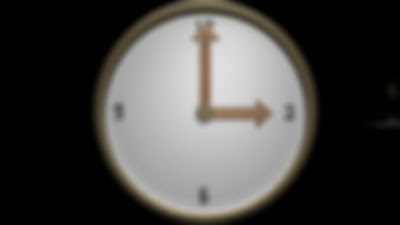
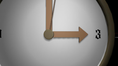
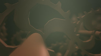
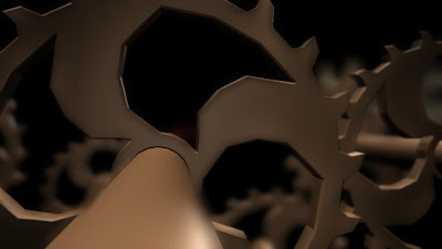
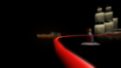
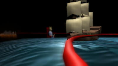
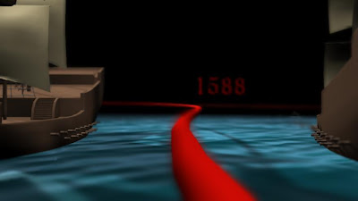
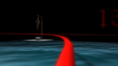
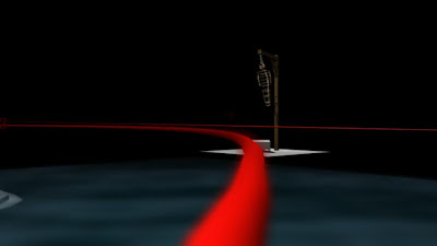
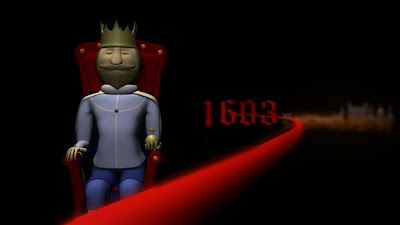
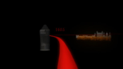
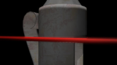
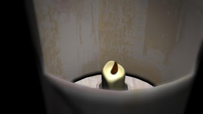
Depth Of Field
Depth of Field with Graphic Pen filter
Friday, 30 April 2010
Stylizing Timelines cont...
Test 1 for graphic pen filter. This effect isn't looking as horrible as it did in first inspection. Maybe playing with the levels of light and dark might help the objects to stand out under the graphic pen effect.
Wednesday, 28 April 2010
New Research
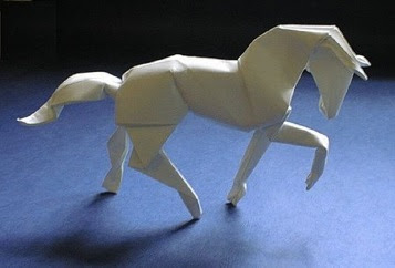
ORIGAMI, the style choice for this animation has been staring me in the face and I completely over looked it. It is the most obvious and logical of answers, for the majority of the project and the original concept it is somthing I should have seen. The style of origami paper folding rifts on two concepts of the silhoette scene,(my main story)1, the use of paper, coloured of otherwise and the history of east asian art. Tests need to be carried out to be sure this is the right way forward.
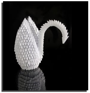
Stylizing Timelines recap.
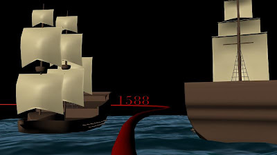
Maya Render

Graphic Pen

Poster Edges and 50% desaturation
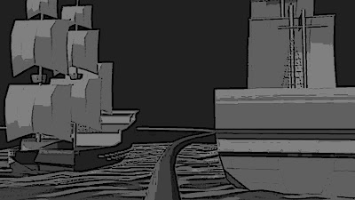
Grey Scale
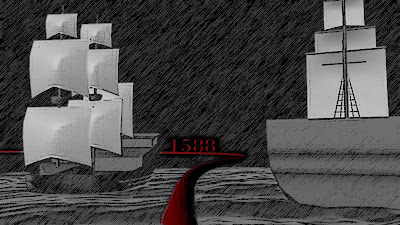
A combination of graphic pen and desaturation

65% desaturation and a papery bump and texture

65%desaturation, poster edges, and a papery bump and texture
The paper bump is seen clearer in previous posts about the papery renders

Papery bump and texture, grey scale

Papery bump and texture, grey and white scale. In this one i tried pushing the contrast in light and dark to its limits.

The same as above with red time line
The paper bump map within these renders may need to be pused further. the more I test a try out new styles, the more I like the idea of this scene being made out of paper. Papery textures and styles need to be experimented and pushed further.
Tuesday, 27 April 2010
Stylizing Timelines cont...
I thought about what the original concept ment to me. The idea of using shadow pupets ment the theory behind the use of paper cut outs to teel the story, so why not have everything on the time line textured with crumpled paper.


This is somthing that has worked well for the clock texture, this may have been more success full for the clock than the ships as the clock is created from texture files where as the ships (up to now) didn't need to be. However the reverse can be said the edgings of the texures, the poster edge effect works well for the ships image however it is far to potent for the clock scene. Is there a comprise for this? I'm not sure, more tests are needed with other key shots to see. Further tests and changes need to be made to the ships to make this idea work. The colour of the sea itself is still to in-your-face at the moment.
Interim Crit and the last 5 Week Plan
Time table of whats left to be done:
Week 11:
By the end of this week I plan to have completed all of modeling, lighting and animation process. I have a few small items to model and add to the time line to clear up understanding of the 1701 Captain William Kidd event on the timeline. I need to model his hat and a treasure chest to clarify the idea of piracy. I also plan to begin more texture test to find the right style to pull every aspect of the project into line.
Week 12:
I plan to complete and re-texturing and stylising from week 11 and start tests for creating the appearance of distance with simple differences in the camera focus. I plan to test two versions of this to find what works, firstly with itself in Maya and secondly in post production (probably the bets option) in After Effects.
Week 13:
By the end of week thirteen I plan to be ready to begin rendering. If I render within this week, it leave me time to make amendments as and where needed, in case there are any problems. Before I start the rendering process in this week I plan to create a time based animatic with as many sounds needed as possible to carry out one final check on the animation speed, lights, textures, etc.
Week 14:
I plan to have finished all renders within this week and be well into the post production editing, sounds, and levels of camera focus.
Week 15:
By the end of week fifteen my animation will be complete (figures crossed). At this stage and with this forward planning time table I can foresee a few days leeway which allows for any problems which I may into.
Over the next five weeks alongside my project I plan to complete at requirements of the profession portfolio, along with business cards and website.
Monday, 26 April 2010
Sunday, 25 April 2010
Render Test
Saturday, 24 April 2010
Filling scene.
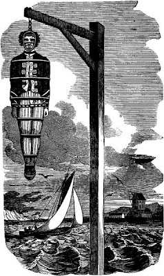
Wednesday, 21 April 2010
Time Line Scene
Sunday, 18 April 2010
Pre-vis
(double click the link to watch on you tube)
Friday, 16 April 2010
Render Problems
I have come across many problems with with my cannon ball splash scene. The first problem was getting the particles of the splash to render at all. Alan showed me a renderer from a much older version of Maya, the Maya Render Buffer which has allowed me to render the particles of the cannon ball splash. The Maya Render Buffer has nearly as many function as the normal Maya hardware and software renderer we generally use. However with all these controls at my disposal, I have still had a few problems when putting the layers together. It appears that so far through my testing I have not created an alpha channel for the particles layer, there fore the particles do not appear in the scene as they should.
Having found the alpha the final text below (the 3rd clip) works out the best, however i have used the particles layer in the final render 3 times as it looked very translucent.
