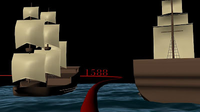
Maya Render

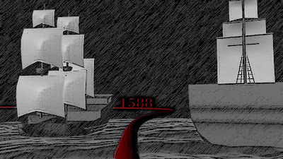
Graphic Pen

Poster Edges and 50% desaturation

Grey Scale

A combination of graphic pen and desaturation

65% desaturation and a papery bump and texture

65%desaturation, poster edges, and a papery bump and texture
The paper bump is seen clearer in previous posts about the papery renders

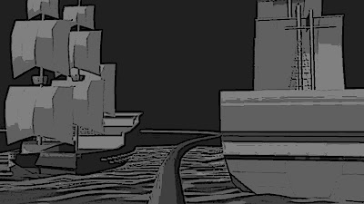
Papery bump and texture, grey scale

Papery bump and texture, grey and white scale. In this one i tried pushing the contrast in light and dark to its limits.

The same as above with red time line
The paper bump map within these renders may need to be pused further. the more I test a try out new styles, the more I like the idea of this scene being made out of paper. Papery textures and styles need to be experimented and pushed further.

Hi Leanne,
ReplyDeleteThanks for uploading your images. I've got to say on closer inspection i'm still liking the 'Graphic Pen' style. This may not be exactly where you head in your style rationalising but its certainly a good start.
I would look into how you may be able to develop this technique into a 3D version instead of a filter. But either way this seems like something that could snap all your sequences into line. It definately suits the period and could be a quick fix for both your 3D models (ships etc) and your shadow puppets.
As a test, try converting a texture in Photoshop to a 'Graphic Pen' image. Apply it to a model and render a turnaround. Finally, perhaps convert the whole sequence into 'Graphic Pen' images again (Using batch processing in Photoshop). It could be an interesting test.